← Use CasesFood Delivery App Icons
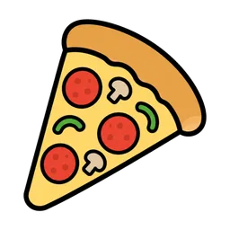
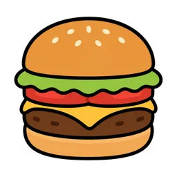
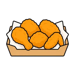
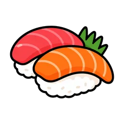
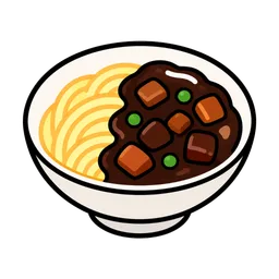
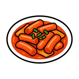
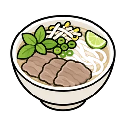
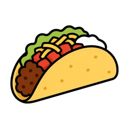
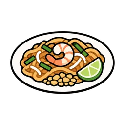
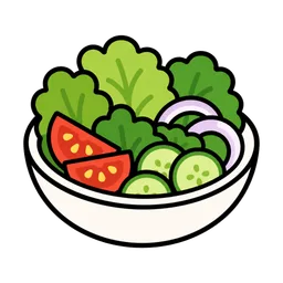
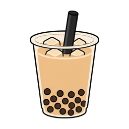
Cuisine filters are the first thing users tap in a delivery or ordering app. Clear category icons — pizza, chicken, sushi, dessert — cut decision time and make browsing feel effortless on small screens.
Practical tips
- Use the Sticker style for filter chips. Bold outlines survive 24–48 px rendering; test your chips at the smallest size they will actually display.
- Represent categories, not specific dishes. One recognizable icon per cuisine (pizza for Italian, sushi for Japanese) beats ten similar ones.
- Ship PNG 128/256 or WebP. Screens rarely need more than 256 px for a chip; smaller assets keep the bundle lean and lists scrolling smoothly.
- Transparent backgrounds adapt to themes. The same asset works in light mode, dark mode, and brand-colored chips.
- Keep a consistent visual weight. Mixing outlined and photographic icons in one row looks broken — stay within one style family.
FAQ
Can I ship these icons inside a commercial app?
Yes. Yoricon icons are free for commercial use with no attribution, including apps that are sold or monetized. You may not resell or redistribute the icon files themselves.
PNG or WebP for an app bundle?
WebP is smaller and is supported natively on Android and on iOS 14 and later. If you must support older OS versions or your build pipeline expects PNG, use PNG 256 or 128.
Why do sticker-style icons work best at small sizes?
Bold outlines and flat colors keep shapes recognizable at 24–48 px, where soft gradients and fine detail tend to blur.
Related
Start with the category list and download the sizes your app needs.